

EXPLORE
MY PROTOTYPE
EXPLORE
MY PROTOTYPE
Press 'R' to reset


Project Overview:
Project Overview:
Higo.id Website Improvement
Higo.id Website Improvement
Background:
Background:
As part of my UI/UX bootcamp at Purwadhika Technology School, Jakarta, in 2022, I completed a personal study case focusing on enhancing the user experience for the Higo.id website, an e-commerce platform that offers digital products like gift cards, mobile top-ups, and gaming vouchers. The objective was to identify usability issues and propose improvements to optimize the site for better conversion rates, user satisfaction, and seamless navigation.
As part of my UI/UX bootcamp at Purwadhika Technology School, Jakarta, in 2022, I completed a personal study case focusing on enhancing the user experience for the Higo.id website, an e-commerce platform that offers digital products like gift cards, mobile top-ups, and gaming vouchers. The objective was to identify usability issues and propose improvements to optimize the site for better conversion rates, user satisfaction, and seamless navigation.
Role:
Role:
UI/UX Designer
UI/UX Designer
Tools:
Tools:
3D Blender & Photoshop
3D Blender & Photoshop
Start:
Start:
February 2022
February 2022
Objective:
Objective:
The goal of this project was to revamp the Higo.id website’s user interface and experience by addressing common usability issues. The focus was on improving product discoverability, simplifying the purchasing process, and increasing engagement through design enhancements, all while maintaining the brand's visual identity.
The goal of this project was to revamp the Higo.id website’s user interface and experience by addressing common usability issues. The focus was on improving product discoverability, simplifying the purchasing process, and increasing engagement through design enhancements, all while maintaining the brand's visual identity.
Project Scope:
Project Scope:
User Research:
Conducted interviews and surveys with users to understand their pain points when purchasing digital products, including difficulties in navigation and checkout, and confusion around product categories.
Created personas representing typical users of the platform, such as gamers, gift buyers, and mobile users, to guide the design process.
Pain Points Identified:
Navigation Confusion: Users struggled with finding specific products due to the unclear categorization of items and a cluttered homepage.
Complex Checkout: The multi-step checkout process was long and led to drop-offs, especially on mobile devices.
Limited Visual Appeal: The website's design lacked the modern, engaging aesthetics expected by its younger, tech-savvy audience.
Design Solutions:
Enhanced Navigation and Product Filtering: Reorganized the site’s structure with a clearer hierarchy for categories (e.g., gift cards, gaming vouchers, mobile top-ups), and implemented filtering options to allow users to quickly find the products they’re looking for.
Streamlined Checkout: Simplified the checkout process by reducing the number of steps, introducing a guest checkout option, and optimizing the form fields to require less input from users. The checkout experience was also optimized for mobile responsiveness.
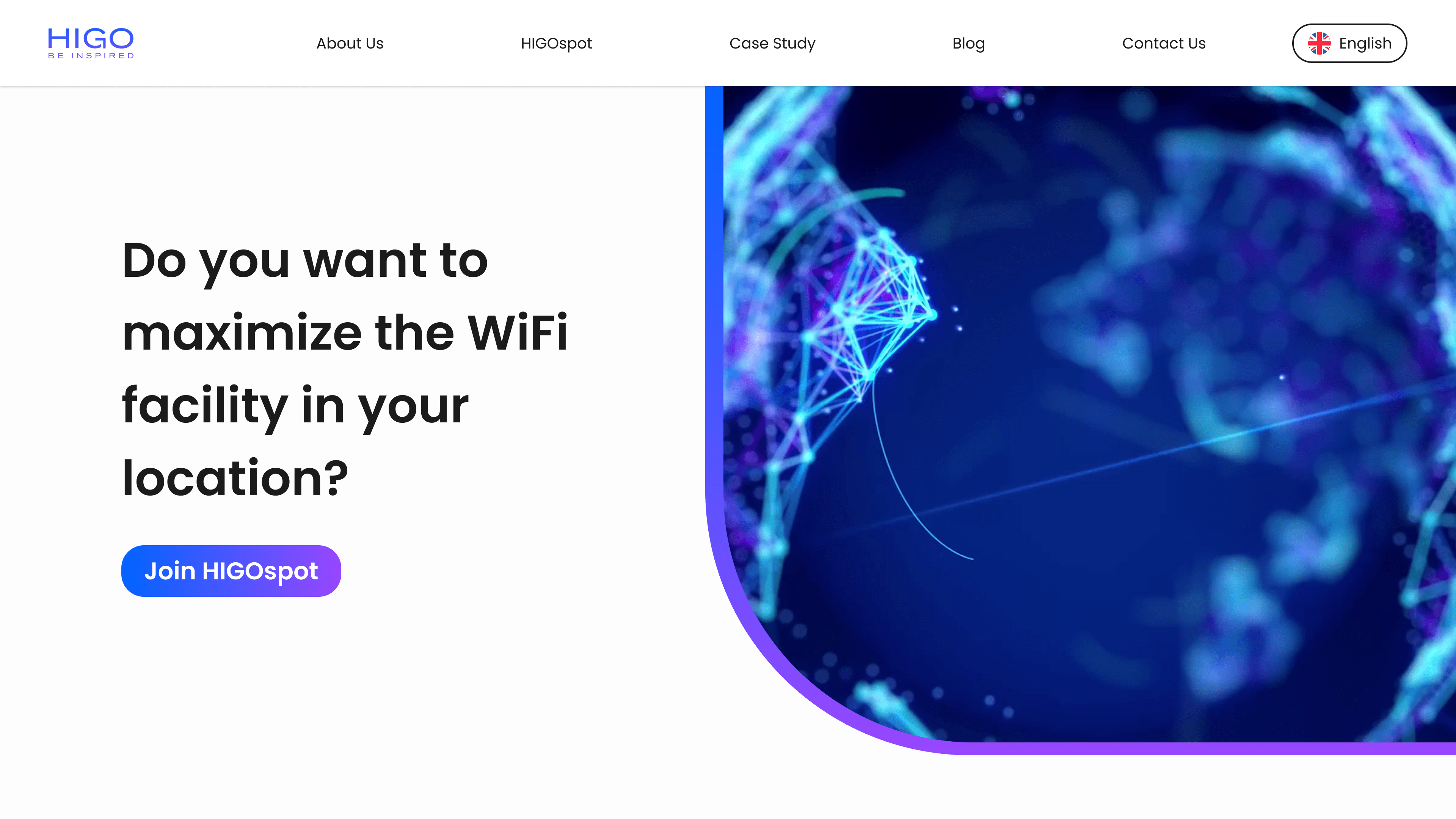
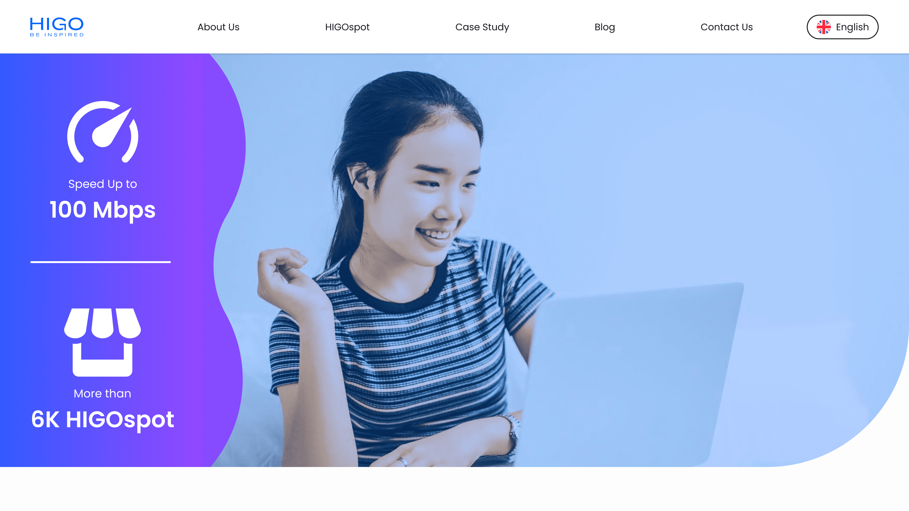
Visual Design Refresh: Updated the UI with a cleaner, more engaging design that uses bright colors and dynamic visuals in line with Higo.id’s tech-focused brand. The visual improvements aimed to make the website feel more modern and appealing to a younger demographic.
Improved Call to Action (CTA): Strengthened the CTAs by using more prominent button placements and colors, ensuring users are guided effectively to complete purchases or explore products.
Prototyping and Usability Testing:
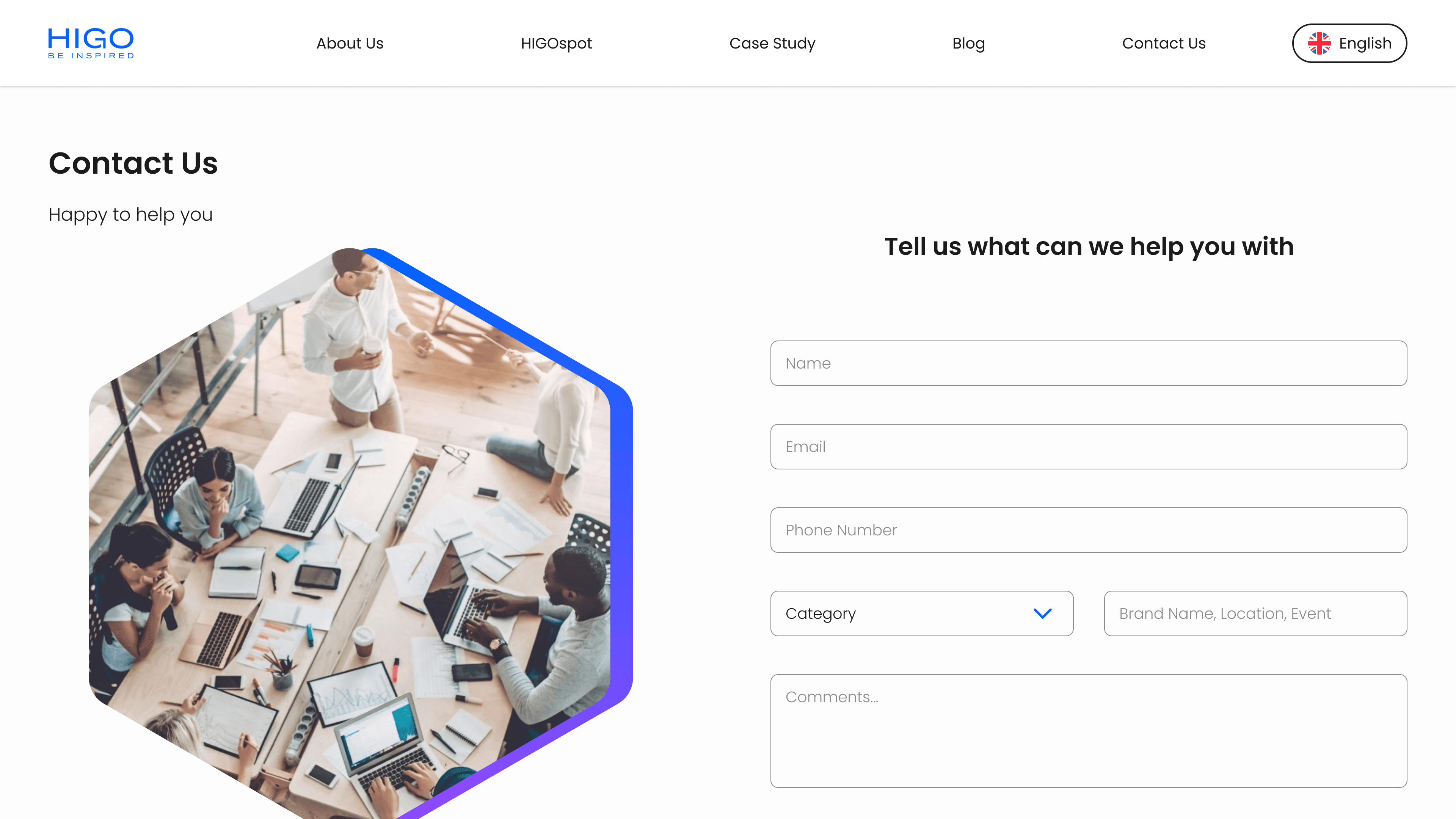
Developed high-fidelity wireframes and prototypes in Figma to demonstrate the improved user flows for navigation, product discovery, and checkout.
Conducted usability tests with a sample group to validate the effectiveness of the redesign. Based on feedback, made further adjustments to simplify the user journey and enhance mobile performance.
Hypothetical Outcomes:
Projected improvements in user engagement and conversion rates, with potential reductions in cart abandonment by 25% due to the simplified checkout process.
Hypothetical metrics indicated an increase in product discovery and purchases due to the enhanced navigation and filtering options.